
BUILTRIX
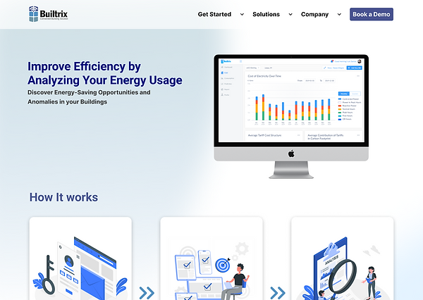
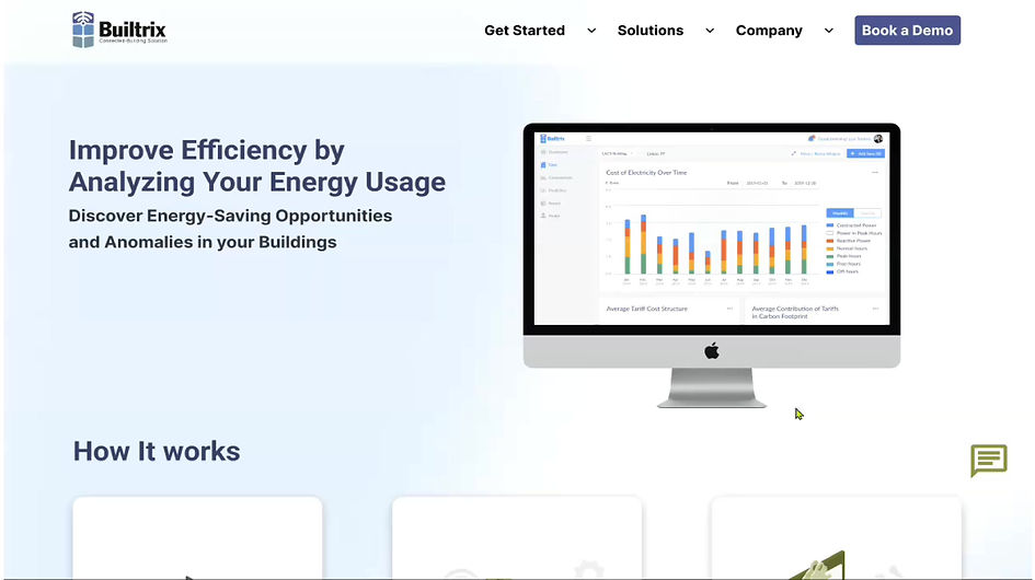
Analyzing Your Energy Usage
Discover Energy-Saving Opportunities and Anomalies in your Buildings
Challenge
Builtrix presented two academic challenges:
-Challenge 1 was to redesign the dashboards to enhance the user's ability to process information.
-Challenge 2 involved revamping the landing page to prioritize use cases.
Despite both challenges being significant, I opted for Challenge 2 as I believed it would have a more profound impact. Since the dashboard primarily catered to existing customers, and Challenge 2 aimed to attract new customers, I considered it to be more beneficial for Builtrix.
Role
UX/UI Design
UX Research
Scope
Heuristic Evaluation
UX Research
Usability Testing
Prototyping
Tools
Figma
Figjam
Notion
Timeline
2 weeks
90 hours
Empathize
Define
Ideate
Prototype
Deliver
Design Thinking Process
-Google Analytics
-Heuristic Evaluation
-User Testing
-Business & Competitive Analysis
-Problem Statement
-How might we?
-Proto-Persona
-User Flow
-Feature Prioritization
-Moodboard
-Brand Attributes
-Lo-Fi Prototype
-Mid-Fi Prototype
-Desiriability Testing
-Hi-Fi Prototype
-Design System
-Stakeholder Feedback
-Key Learnings
Empathize
Google Analytics Heuristic Evaluation & User Testing Competitive Analysis Key Insights
Google Analytics
Google Analytics reveals user journey patterns, showing that out of 60 users, 32 dropped off immediately after landing on the About Us page, and an additional 12 dropped off at that point. This emphasizes the significance of optimizing the landing page, as it serves as the primary area for user drop-offs.
Web Analytics

Heuristic Evaluation & User Testing
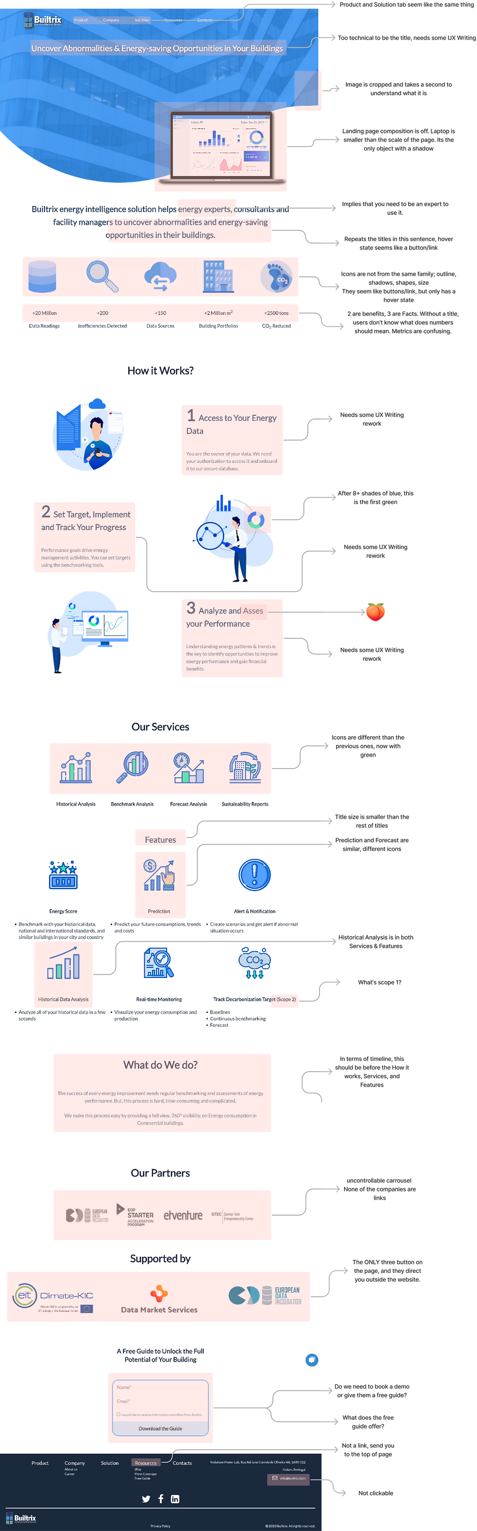
While conducting a heuristic evaluation and 5 user tests, I encountered several heuristic pain points on their existing landing page website. Which I highlighted below.
Landing Page Evaluation
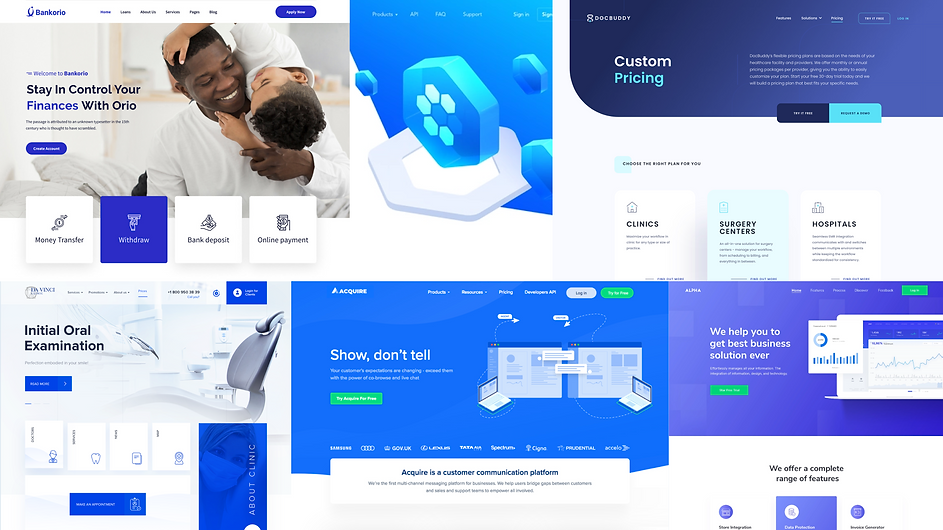
Competitive Analysis
We must conduct a competitive analysis to evaluate companies offering similar services to Builtrix, including Builtrix itself. The analysis includes assessing whether each company has a call-to-action button for demo booking and if they have an introductory video, along with a list of their website's pros and cons.
Analyzing our competitors is crucial as users actively compare software options.
If our competitors offer features that we lack, it highlights our weaknesses.
Comparative Infographics

Key Insights
These insights collectively provide a roadmap for addressing the identified issues, refining the user experience, and aligning Builtrix's offerings with market demands. By implementing the recommended improvements, Builtrix can enhance its website's usability, engage users more effectively, and stay competitive in the market.
No CTA button for Booking a demo
Outdated Interface
Information Architecture is misaligned
In need of UX Writing
Incosistency in colors and illustrations
Define
Problem Statement How might we? Proto-Persona
Problem Statement
There appears to be a level of confusion among users regarding the company's identity and core offerings, and despite gaining clarity, they do not appear to be adequately guided towards booking a demo, which is our primary objective.
How might we?
How might we redesign our websites interface to be more intuitive, cohesive and has a smoother flow showcasing the benefits of our product guiding potential customers towards booking a demo so that clients are able to track and manage their energy consumption
Proto-Persona
As this project was undertaken within an academic context and required interviews with a specific target audience, the pool of eligible participants was limited. I developed a proto-persona representing the intended user profile to guide the evaluation of the websites.

Joao
45yo
City Manager
Goals:
Reduce the city's energy consumption
Challenges:
Limited budget for implementing energy-saving measures
Values:
Sustainability and environmental stewardship
Ideate
User Flow Feature Prioritization Moodboard Brand Attributes
User Flow
In terms of the user flow, Joao would typically begin by navigating to the homepage of the website. There, he would explore the provided information, benefits, and features offered. Next, he would delve into a case study showcasing the application of the product/service for a public entity, particularly relevant for his interest in city applications. Subsequently, Joao would proceed to either book a demo or obtain a free guide to further engage with the offerings.
User Flow

Feature Prioritization
In order to establish clear priorities for the implementation of my ideas and desired features, I needed to determine a hierarchy. Among these, the top four features held greater significance and were assigned a higher priority compared to the remaining ones. This approach allowed me to focus primarily on these key features initially while keeping flexibility for future project iterations to incorporate the remaining features if time permits.
Features

Moodboard
These selected interfaces exhibited a cohesive theme in terms of color palette and layout. By recognizing and acknowledging these common elements, it facilitated the establishment of a consistent visual direction for the project.
Moodboard
Brand Attributes
With the Microsoft Desirability Toolkit, I requested Javad "the CEO" to carefully choose five descriptors that best aligns with Builtrix. After careful consideration, Javad identified the following attributes:
These attributes reflect Javad's specific vision for the desired characteristics that he wishes the filters to possess.
Trustworthy
Easy to Use
Empowering
Innovative
Responsive
Prototype
Lo-Fi Prototype Mid-Fi Prototype Desirability Testing Design System Hi-Fi Prototype
Lo-Fi Prototype
To encourage my artistic expression and creative vision, I decided to draw the initial wireframes by hand. I separated the landing page into different sections, such as Landing, How it works, Benefits, Features, Testimonials, and Footer, in a specific order that felt appropriate. This organization of information flowed naturally and helped me establish the desired sequence for presenting content on the page.
Wireframes
The landing should have a clear composition that effectively communicates the company's purpose.
A concise three-step process, we can effectively educate individuals on what Builtrix offers.
Aligning benefits and features in parallel allows users to leverage the full range of advantages.
Using big numbers effectively grabs attention and encourages users to discover important statistics about the company.
The highly discussed call-to-action button

Mid-Fi Prototype
Following the completion of five user tests on the low-fidelity prototype, I incorporated iterative improvements to address the identified pain points associated with navigating the interface.
Wireframes
The second call-to-action button
A footer enhances website navigation capabilities.
Based on user feedback, the recommendation was made to incorporate a CTA button on the landing page.
Icons were added to improve step comprehension.
It was advised to establish a different hierarchy between benefits and features.
The features appear to have a comparatively lesser influence on achieving the persuasive objective.
Both the CEO and the users expressed a strong desire to have testimonials incorporated into the design.
The collaborative partners with whom Builtrix has engaged.

Desirability Testing
Subsequently, I conducted Desirability testing using two distinct Hi-Fi prototype screens. The first screen featured a light theme with a predominantly blue color scheme, while the second screen employed an inverted themed, presenting a contrasting visual aesthetic.
Two screen Test
CLEAN
TRUSTWORTHY
EASY TO USE
ENGAGING
INTUITIVE
CLEAN
TRUSTWORTHY
ORGANIZED
EASY TO USE
INTUITIVE

Upon a side-by-side comparison with the original options, it becomes evident that they are evenly matched. Nonetheless, to break the tie and make a final decision, I prioritize Engagement over Organized. Therefore, I ultimately moved forward with the first option.
Design System
To enhance organization and maintain UI consistency, I developed a design system for Builtrix before creating the high-fidelity prototype. This allowed for easier experimentation with various colors and expedited the design process.
Style guide

Hi-Fi Prototype
To enhance organization and maintain UI consistency, I developed a design system for Builtrix before creating the high-fidelity prototype. This allowed for easier experimentation with various colors and expedited the design process.
User Flow Test
Deliver
Key Learnings Stakeholder Feedback
Key Learnings
Taking on a project with a real client all by myself was a valuable learning opportunity. It taught me the importance of being organized and managing tasks within deadlines. Moreover, through this experience, I discovered that my interest extended beyond just user experience.
I realized that I am equally drawn to the product's vision, making me more of a Product Designer rather than solely focusing on user experience.
Insights & Next steps
Conducting additional user testing sessions with potential customers.
Carefully select and curate illustrations to enhance the visual aesthetics and user experience.
Incorporate additional case studies to provide further insights and examples.
Optimize the chatbot algorithm to improve its functionality and performance.
Stakeholder Feedback
Testimonial
"As the CEO of Builtrix, I had the pleasure of working with Alejandro, a UX/UI designer who proposed to design a user flow for booking demos on our website. I am pleased to say that the experience was nothing short of exceptional.
From the very beginning, Alejandro demonstrated an exceptional understanding of our business needs. He took the time to ask the right questions, understand our pain points, and propose creative solutions. His expertise in UX/UI design was evident from the start, and he brought a wealth of knowledge and experience to the project. Throughout the project, Alejandro was always available to answer questions, provide updates, and address any concerns we had. His communication skills were outstanding, and he always made sure that we were on the same page. He took feedback constructively and was able to adapt quickly to changes in our requirements. The end result was a user flow that was not only visually attractive but also highly intuitive and user-friendly. I would highly recommend Alejandro to anyone looking for a skilled and dedicated UX/UI designer. He is a true professional who takes pride in his work and goes above and beyond to deliver exceptional results.
Thank you, Alejandro, for your great work and dedication to our project! "
Javad Hatami
CEO & Co-Founder
Builtrix