

SPLITWISE
Split bills the easy way
Redesign Challenge

This academic challenge consists of selecting an app for its redesign. The only constraint is that you must choose a well-known native mobile app and redesign at least three screens of your choice. You are not required to conduct any UX research."
Challenge
As you've already read the title of the article, I chose Splitwise. For those who have yet to hear of this app, it simplifies the process of splitting costs by allowing users to create groups and add expenses to those groups, which are then automatically divided among the members.
Role
UX/UI Designer
Strategies
UX Audit
Design Critique
Redesign
Tools
Timeline
Figma
Figjam
3 Days
UX Audit
Heuristic Usability Principles:
Here is a quick recap of the 10 Heuristic Usability Principles:
-
Visibility of system status;
-
Match between the system and the real world;
-
User control and freedom;
-
Consistency and standards;
-
Error prevention;
-
Recognition rather than recall;
-
Flexibility and efficiency of use;
-
Aesthetic and minimalist design;
-
Help users recognize, diagnose, and recover from errors;
-
Help and documentation.
I trust that Splitwise's corporate team is diligently working on enhancing the app's user experience every day. While conducting extensive testing, I encountered a few areas that caught my attention while using the app. Although I wouldn't classify them as significant issues, I believe there is room for improvement.
The system should not waste the user’s attention by displaying irrelevant information or using excessive visual clutter.
The system should cater to both experienced and inexperienced users by providing shortcuts, accelerators, and other powerful features to experienced users and supporting novice users with clear guidance.

Design Critique
It would be a lot of pictures for me to show you all the screens I will have to replicate, so here are the main three that display for the most part the areas I will redesign.

1st Screen
When filtering a group, you can only filter by the balance (who owes whom). When creating a group, you can specify its type (such as trip, house, or couple), but you cannot filter groups by type.
2nd Screen
You can see individual expenses within a group, but you can't pay off a single expense. You have to pay the remaining balance for the entire group. Also, the "Add expense" button takes up too much space on the screen.
3rd Screen
This screen seems to have been forgotten and left behind in the app's to-do list for the next sprint, but it obviously doesn't match the dark-themed interface of the rest of the app.

List of "issues" found during the Heuristic Evaluation
-
Unable to filter by type of group
-
Unable to settle up individual expenses in a group
-
Unable to filter by type in the activity tab
-
There is an “Add Expense” button on 4/5 tabs of the app, the button occupies a significant portion of the screen's real estate.
-
The account settings page does not align with their design system
Redesign
How might we?...
...Implement shortcuts: This will allow experienced users to save time and increase efficiency while still allowing new users to perform tasks at their own pace.
...Offer a range of options: Provide users with a range of options to perform tasks, such as different ways to search or sort data. This will cater to users with different needs and preferences.
Redesigned Features
Group Filtering
Before
After


1
On both the activity tab and group list you are able to filter the groups by type. I did this by adding an additional tab on the filtering pop-up
Toolbar & Add Expense merged
Before
After


The “Add expense” was added to the navigation bar. it's centered and not obstructing the screen. that way the user still has easy access to the button at all times, without taking space on the small screens that a mobile device has.
2
Account Settings Screen Redesign
Before
After

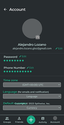
The interface has undergone a noticeable transformation, moving away from its previous white color scheme and becoming more cohesive with the rest of the app's interface.
3
Settling Individual Expenses
Before
After


In order to facilitate the payment of individual expenses, an accelerator and shortcut were implemented for group expenses. The process has been simplified to a single swipe for settling expenses, or by expanding the expense details and clicking on the settle button.
4

Conclusion
In conclusion, the use of UX heuristic principles in app redesign is crucial for enhancing the user experience. By prioritizing the needs and expectations of users, the redesign process can result in a more efficient and effective app that caters to the demands of contemporary users.
Our case study demonstrates the successful application of the eighth UX heuristic principle of "Aesthetic and Minimalist Design" to revamp the app. Through the utilization of white space and a simplified interface, we achieved a clean and elegant look.
The outcome of the redesign was a significant improvement in user experience, as users found the app easier to navigate and use. They appreciated the minimalist design and attention to detail, which contributed to an overall enhanced experience with the app. Moreover, the redesign resulted in a boost in user engagement and satisfaction.